Maps
The following maps I have visualised for projects, with several being added to reports given to government officials and agencies.
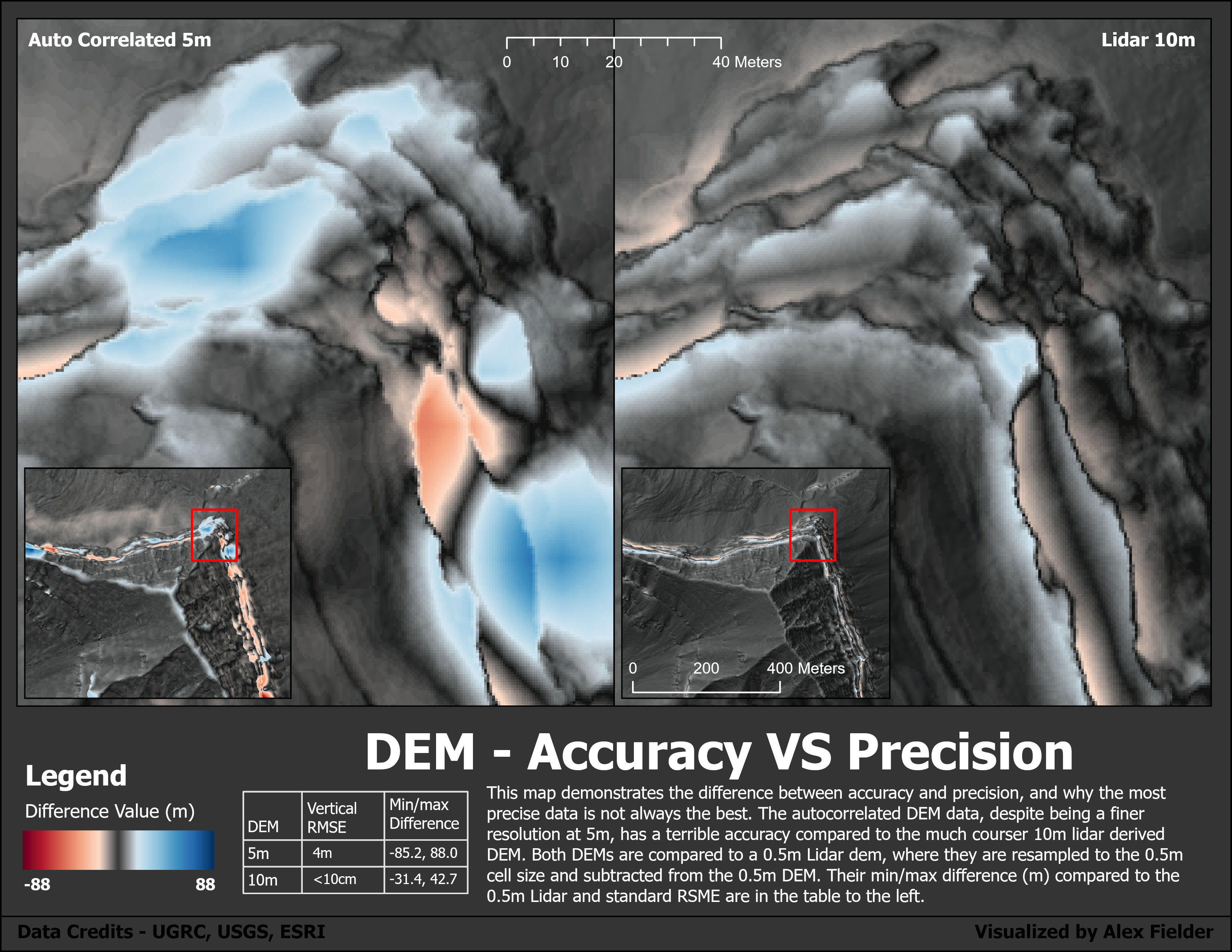
Difference in DEMs
This map is a visual representation of DEM accuracy between cell size and data type. This is a recreation of my original figure which I had the chance to recreate while being a Undergraduate Teaching Fellow for the Advanced GIS course.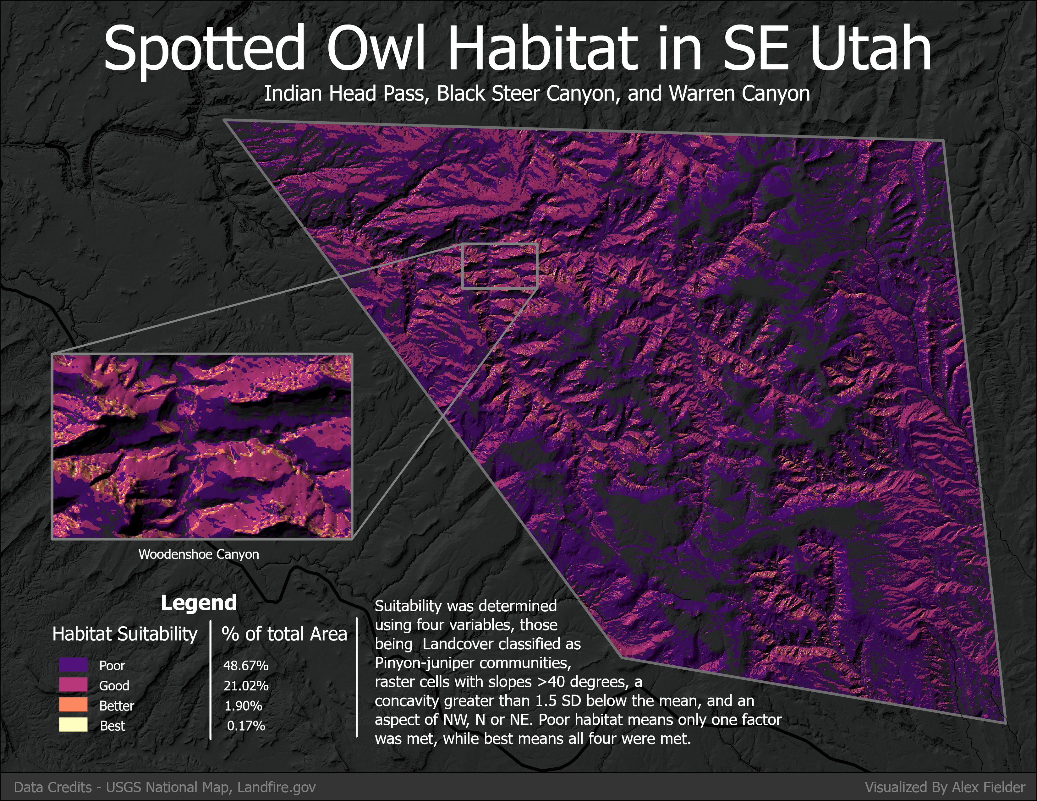
Spotted Owl Habitat
This is another map I had the chance to recreate, and I feel like it is both visually appealing and still provides the relevant information intended.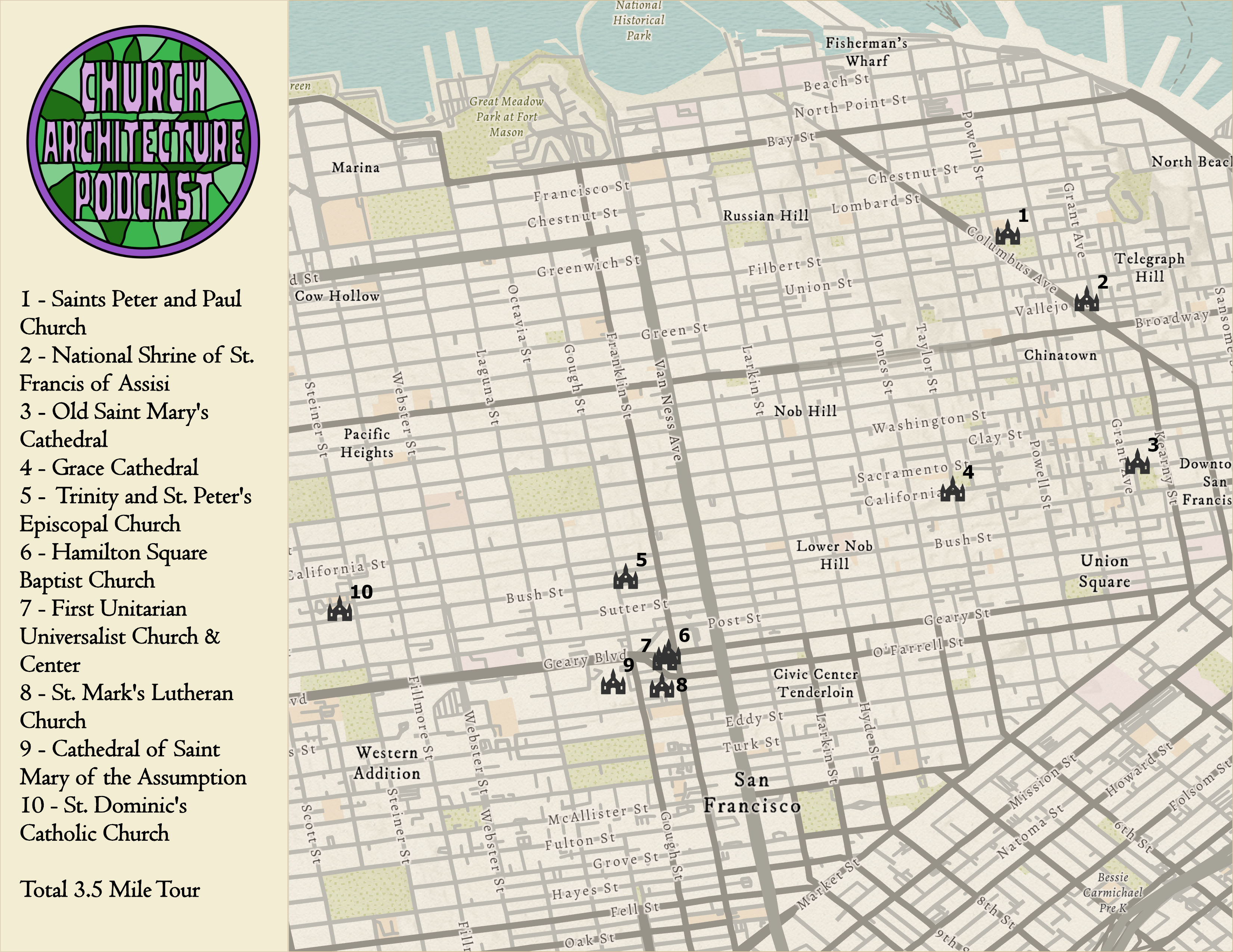
San Francisco Churches
This map was created as a visual aid to show what churches we visited in San Francisco while recording an episode of the Church Architecture Podcast (an infrequent diversion from the other podcast’s normal episodes). I had been looking for a reason to create an “old” looking map for a while, and decided to jump on the chance.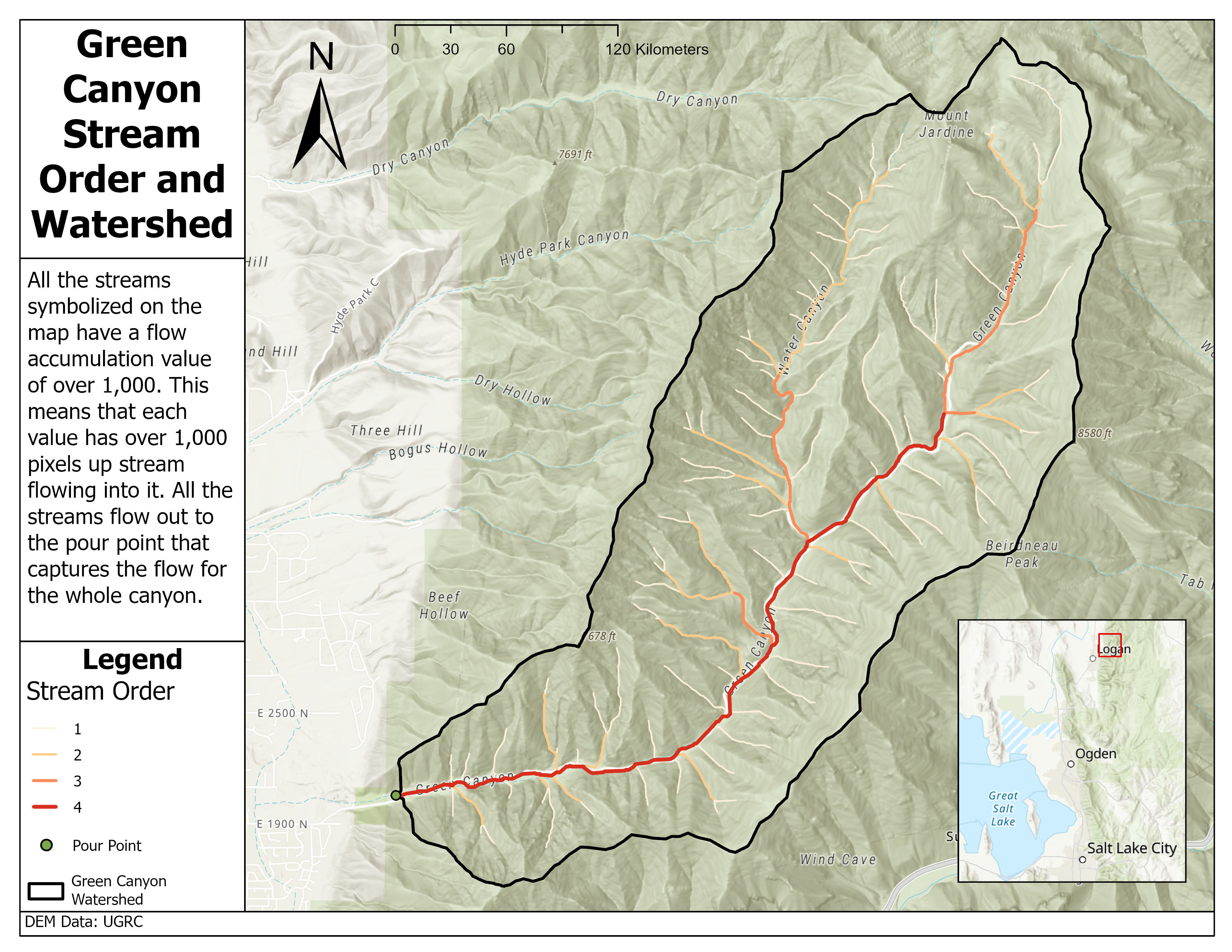
Green Canyon Hydrology
As a part of the Advanced GIS lab, we ran hydrologic analysis of a sub watershed of our choice. This was a practice in stream hierarchy and raster analysis.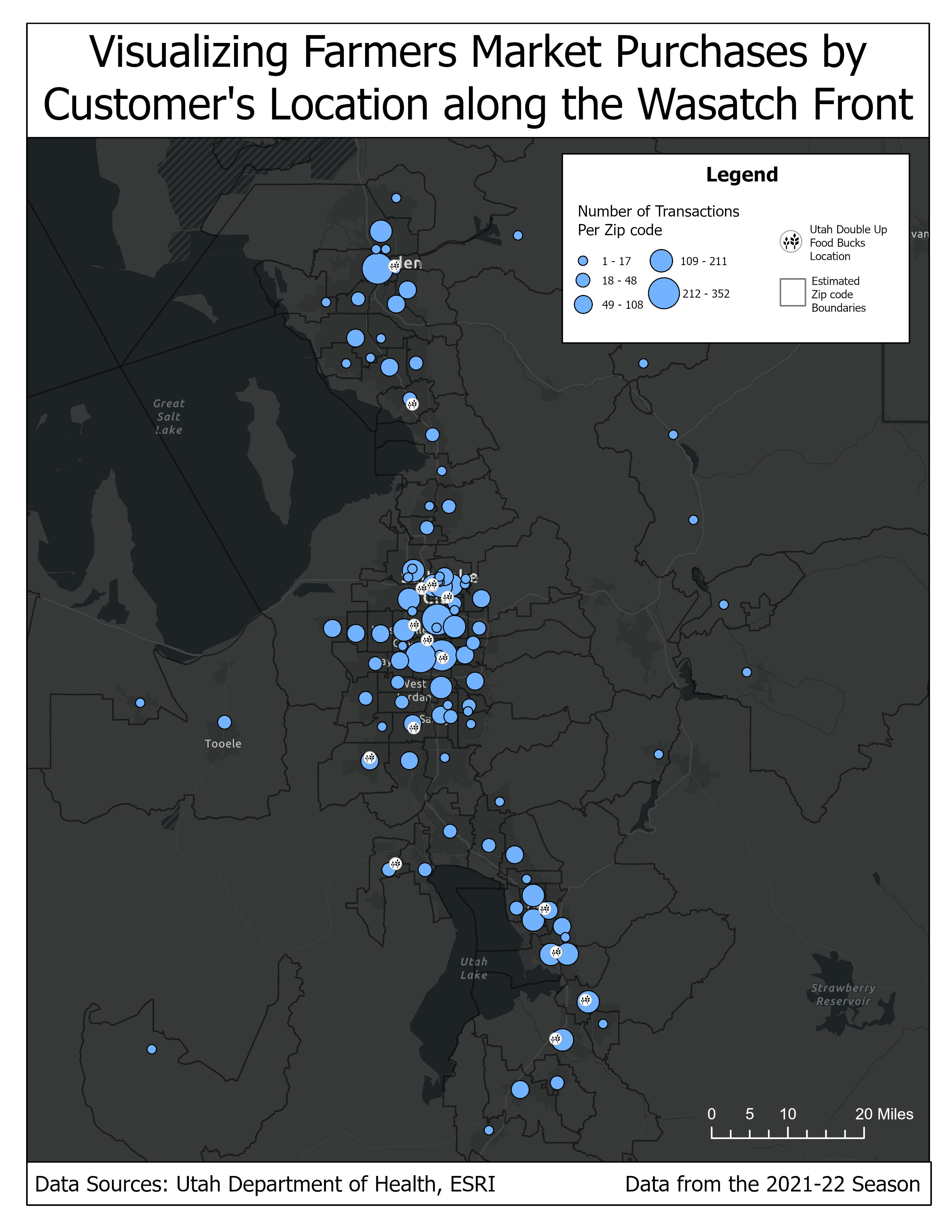
Double Up Food Bucks
This map, with a related Esri Story Map, was made and provided to the Utah Department of Health to distribute to farmers markets across the state. More about that project can be found on the reports page.